Company of Heroes 3
Company of Heroes 3: Topaz Rhino (2.3)
Front End Overhaul - Showcase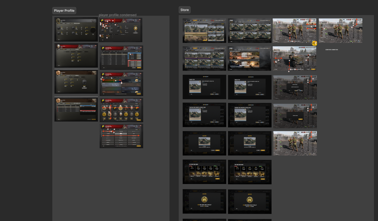
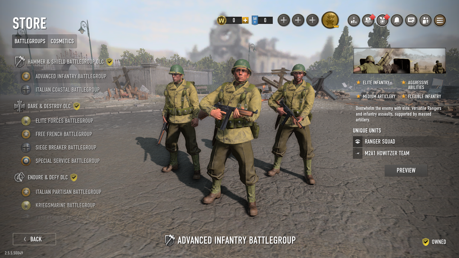
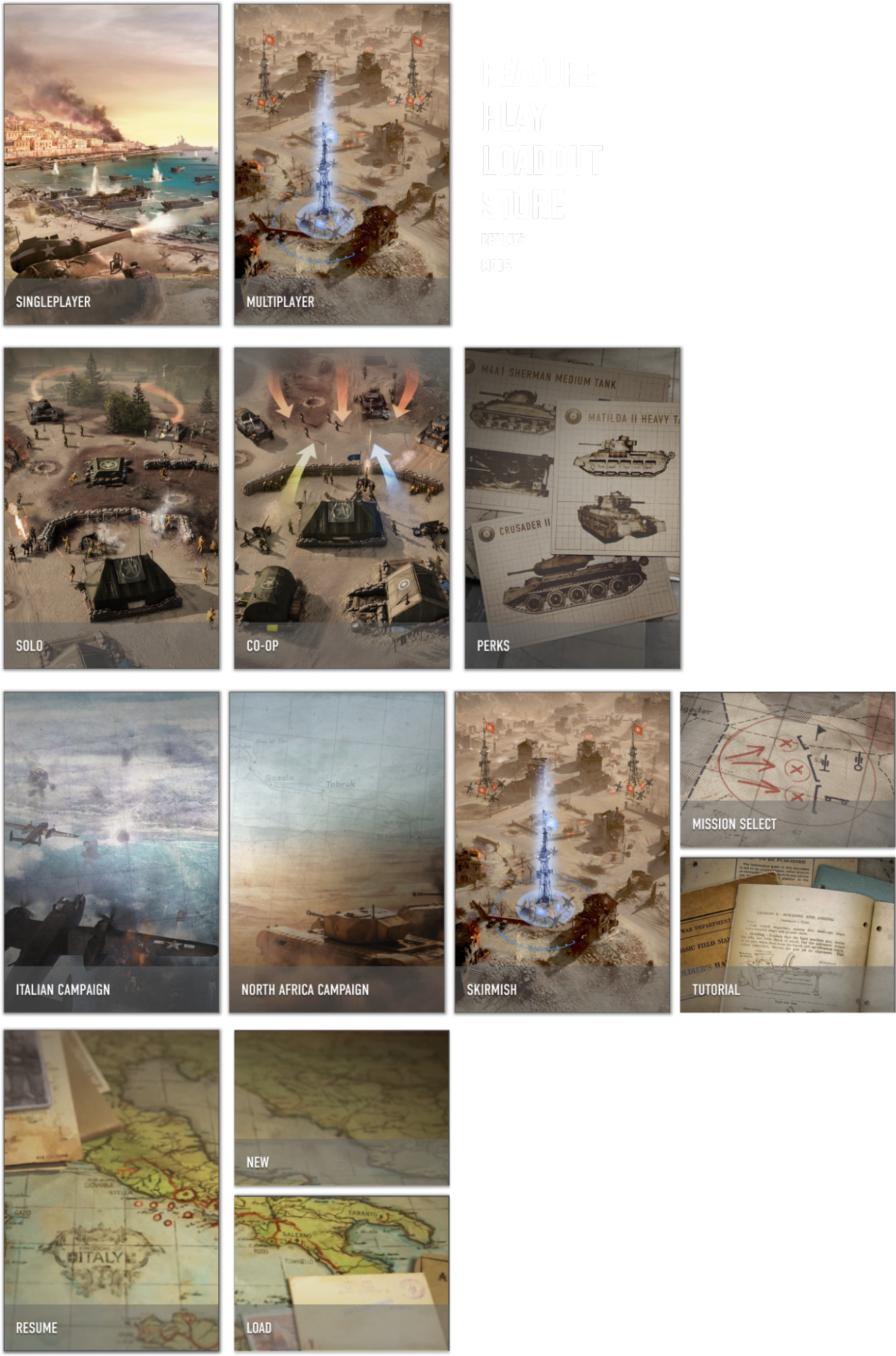
For 2.3, I redesigned the front end of Company of Heroes 3, bringing in a new layout that was more suited to both Controller and PC. There were also considerations for further expansions to the title, so the design also had to be easily extended as new content was added.
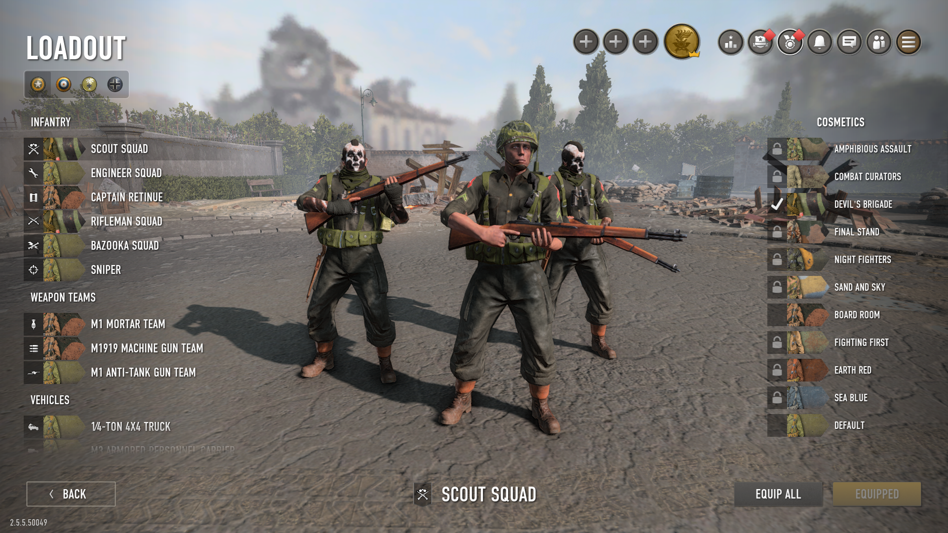
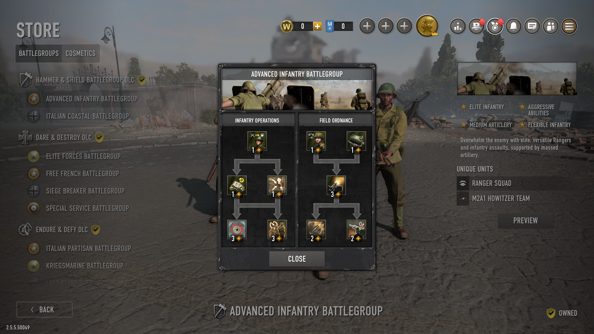
Favorite Challenges Showcase: store, battlegroup viewer and cosmetics
Since launch the game's ingame storefront had been fully 2D, causing hundreds of staff hours being dedicated to rendering out 2D assets previewing all the various cosmetics. These assets were unhelpful for both players and devs as they didn't properly show the cosmetics, and the cost of producing them was prohibitive. When it was made clear that a 3D scene would be possible, I laid out a plan to normalize all the unit displays.
Considerations
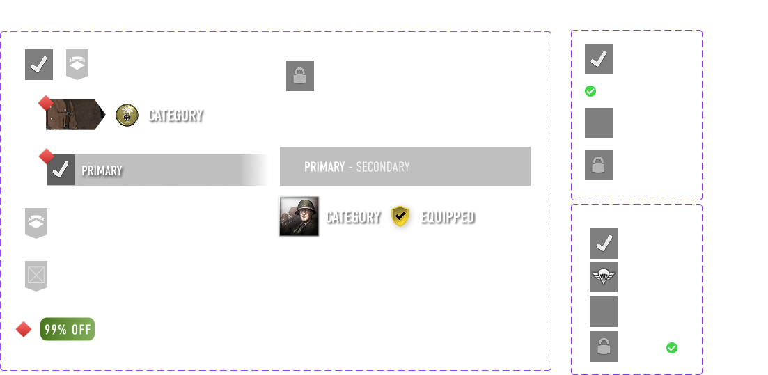
Since salepoint browsability and a satisfying overview of a player's faction were key priorities, I explored similar user experience displays in real life. From that, I found that a combination of paint swatches and notation sticky tabs created a pleasant browsing experience. This solution was also designed from the start to be easy for artists to produce assets for, something they were consulted on at several stages throughout for feedback. I found it was a more appropriate upgrade of a traditional army painter, one which met the UX needs neatly.
Results
On implementation sales went up drastically on cosmetics and the internal art team was able to completely shift focus to creating more elaborate skins in much greater quantities almost immediately. Less time, assets, money and game storage were being used. Additionally the 3D showcase aids the animation team as an inspection tool; many unit quirks are now easily seen and addressed. The showcase is used internally to assess new cosmetics in a lit, game accurate environment as well as trailer captures. Overall, a win for developers and players alike.
Other UI/UX Work for Release 2.3
Company of Heroes 3: Final Stand
Standalone Game + Integrated Game Mode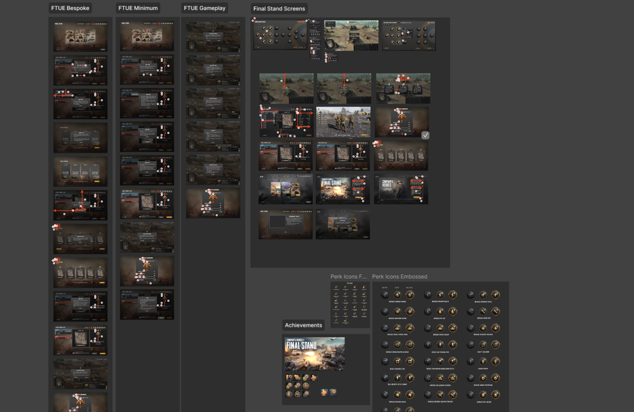
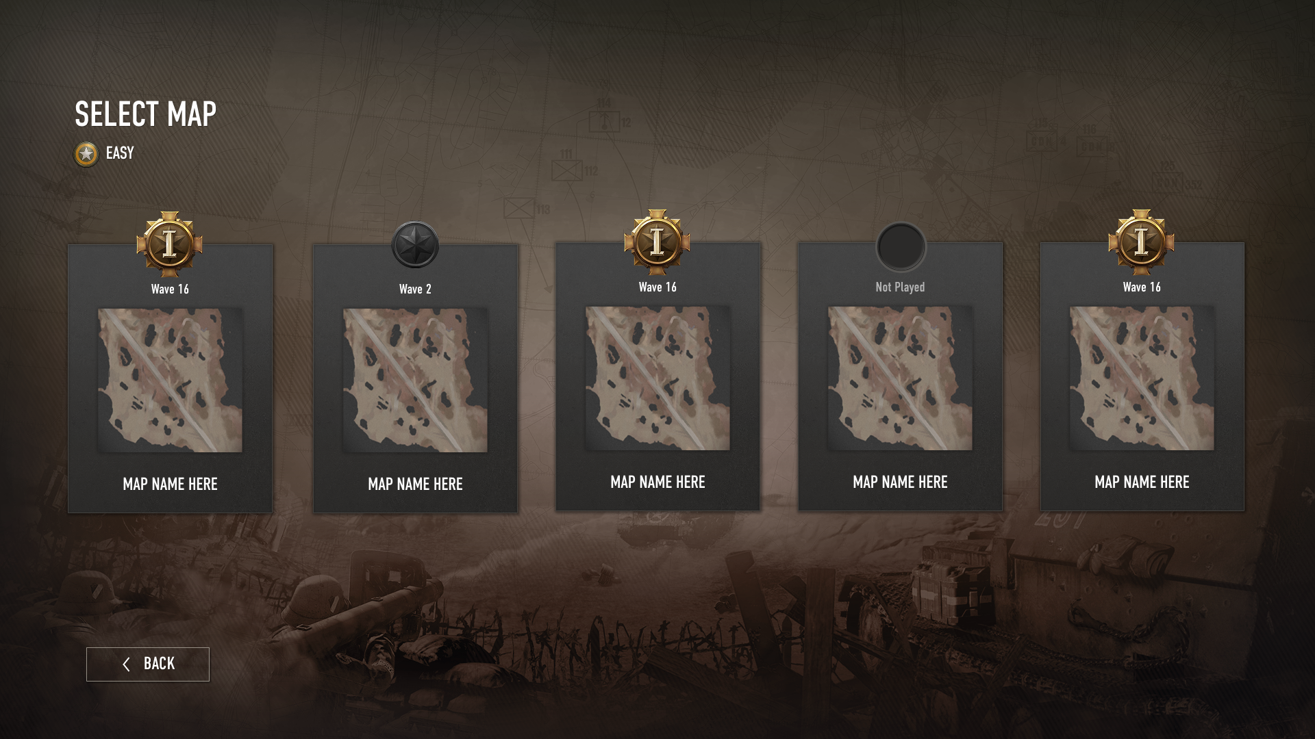
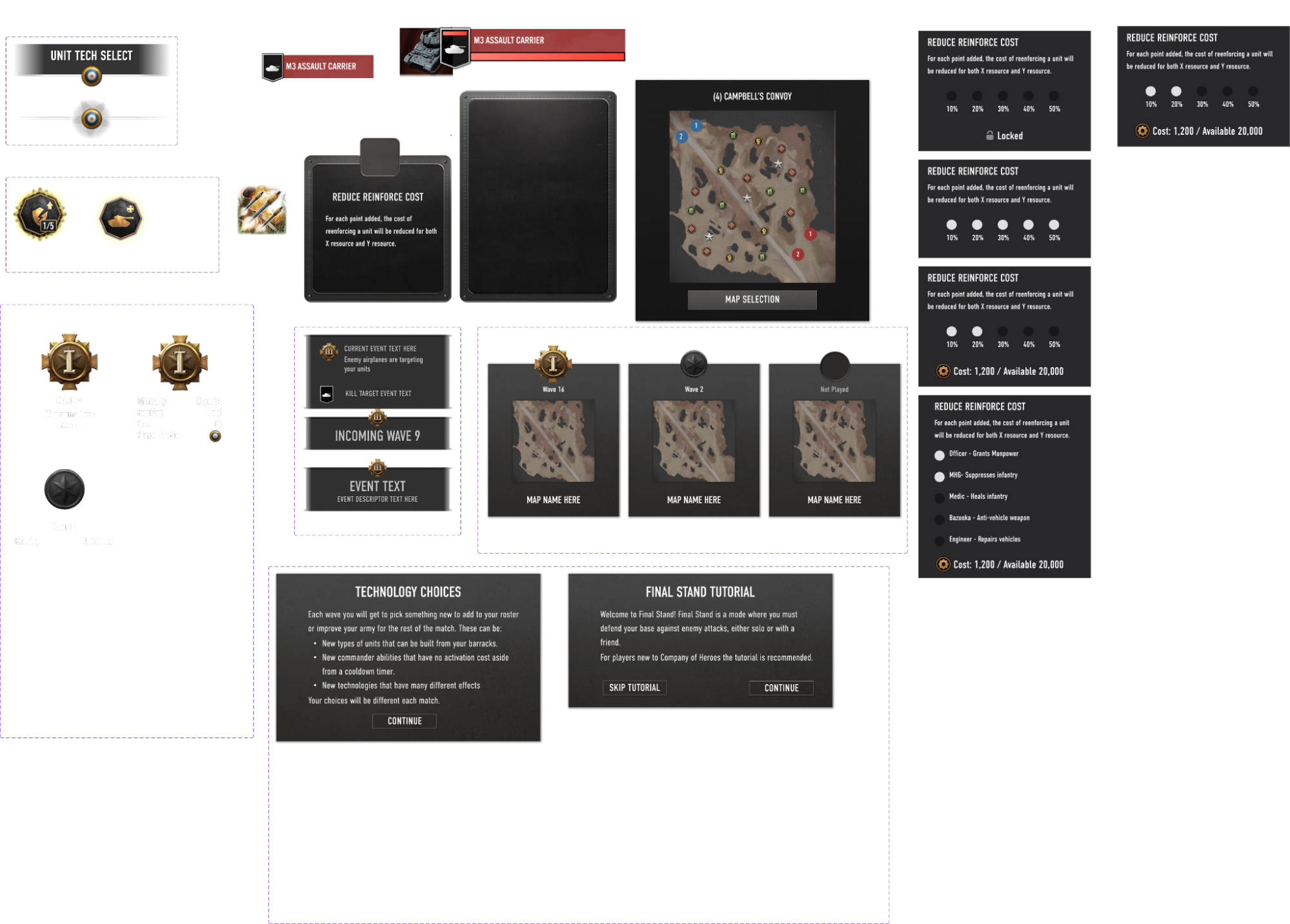
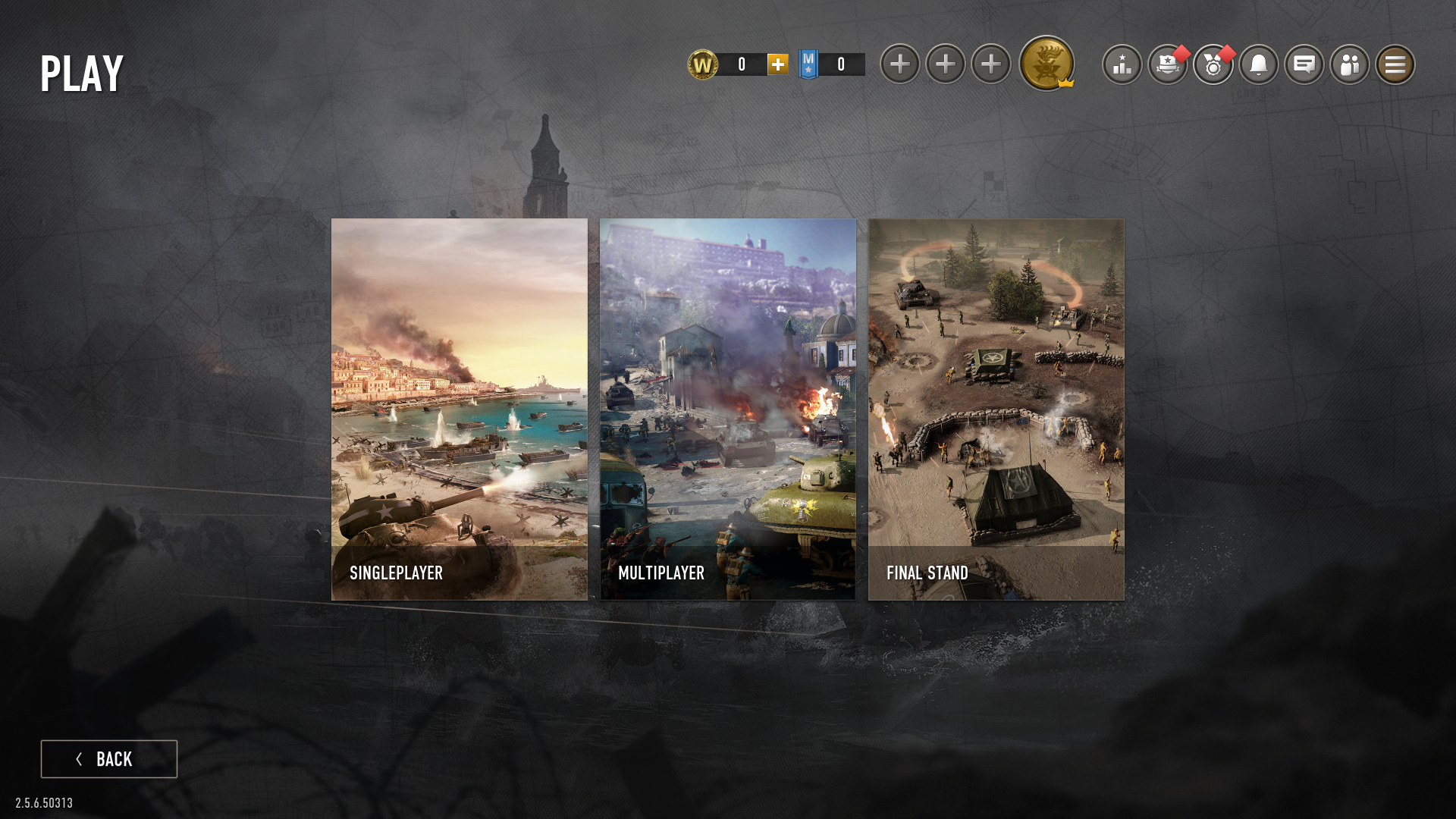
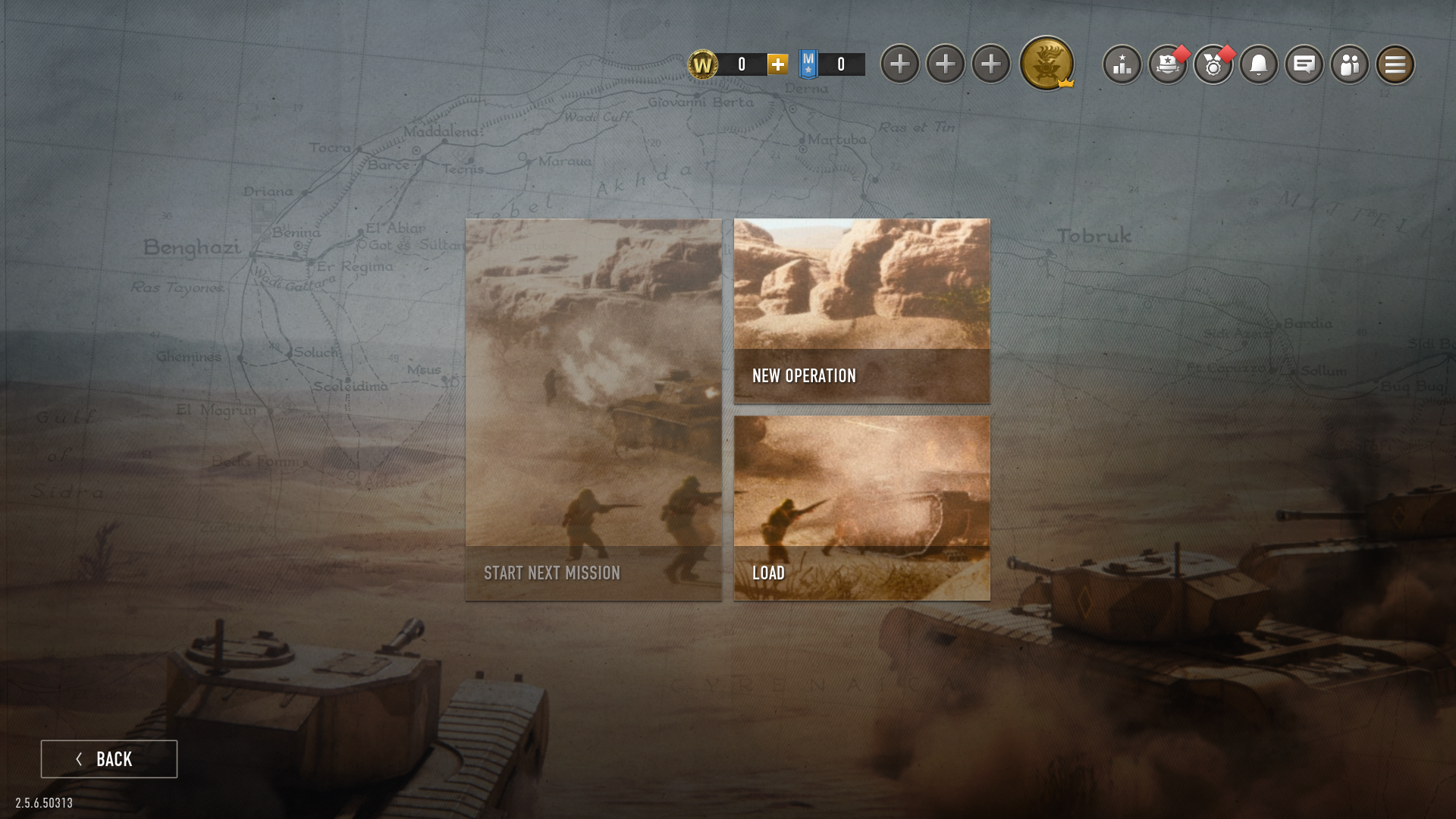
The earlier consideration in patch 2.3 really paid off here. Integration into the base game gave an intentional transitional moment for the player when navigating the UI: Final Stand is clearly part of COH3, but a unique game mode, thanks to the tile layout I intentionally established earlier.
Favorite Challenge Wave Indicator
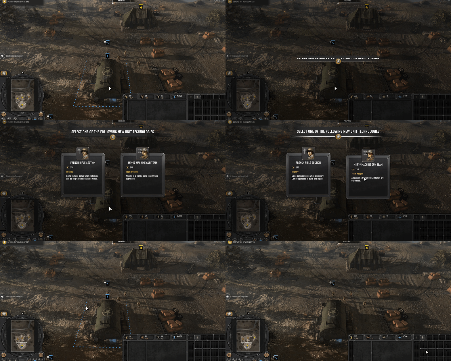
Final Stand had a fundamental major gameplay difference from COH3, in that waves of enemies were continually battering the player. COH3's current UI had no appropriate way to display this as timed events in the campaign prompted player to action, rather than informed shifts in the game's tempo.
Considerations
The design team at this point were unsure of several mechanics, particularly around timing and pacing. As the project was frequently creating types of events that might happen on map and affect the wave length, experiments with reliable time windows between waves were unfortunately not an option. Time amounts could also shift based on player behaviour. All this meant that the straightforward display the game had used in the past was not going to work.
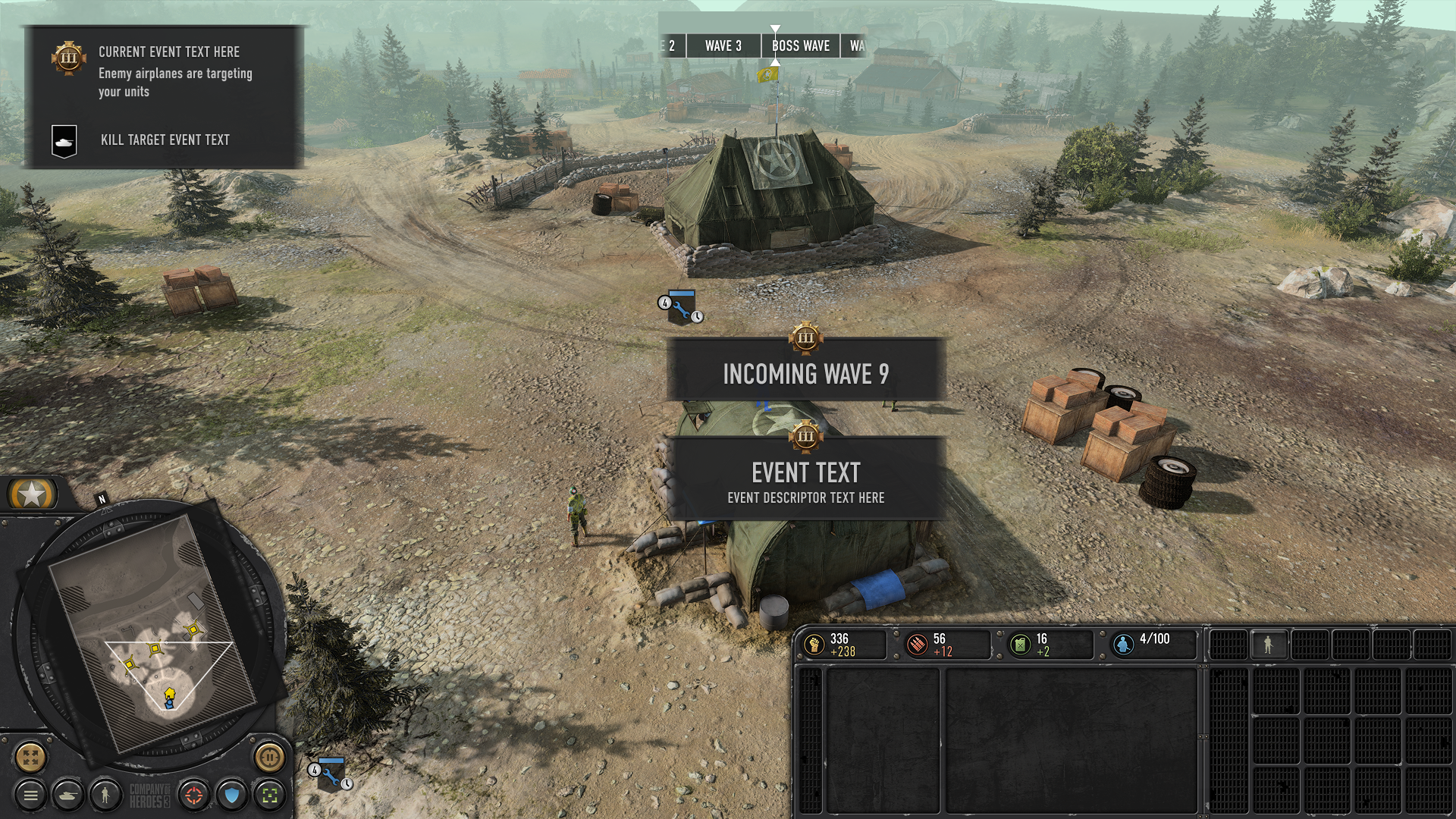
I saw this as an opportunity to make sure that Final Stand could be very identifiable at any gameplay moment from COH3 with a bespoke widget:
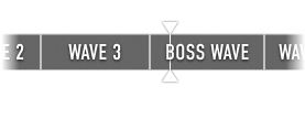
I discovered that fundamentally the precise time between events was not important for players- instead they were concerned with how much relative time was left before the next few events. This meant I could obfuscate precise details but still provide everything a player wanted to know. To avoid the element being too dominant, I created a clean and simple timeline widget where it was always clear where the player is during the match, it could run into an endless number of rounds, and designers could insert events as they desired.
Other UI/UX Work for Final Stand