MechWarrior 5: Mercenaries
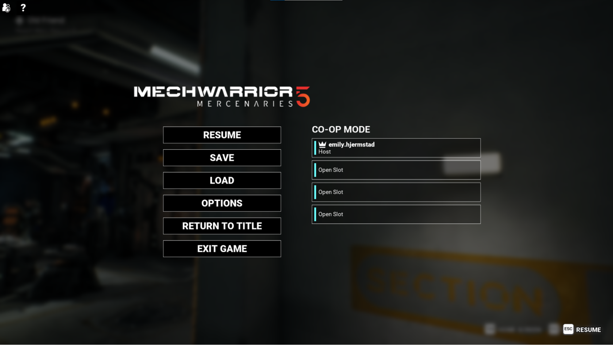
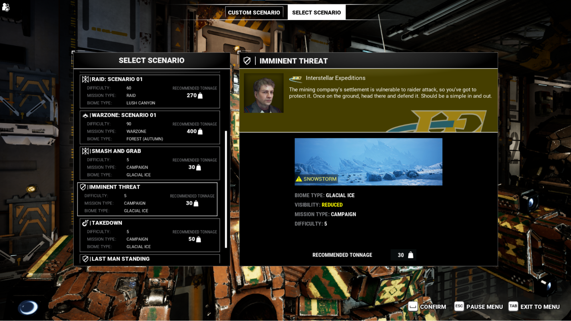
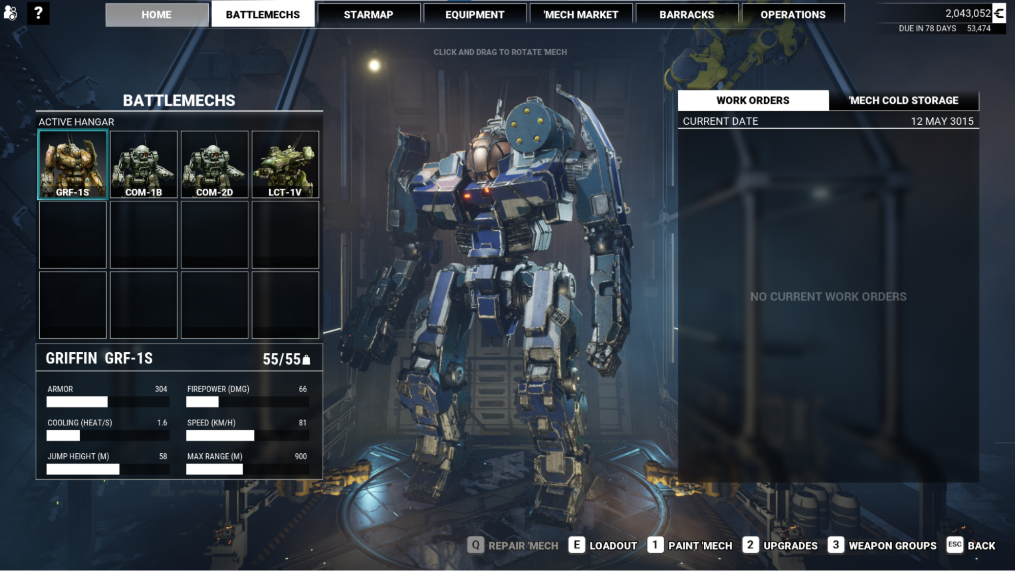
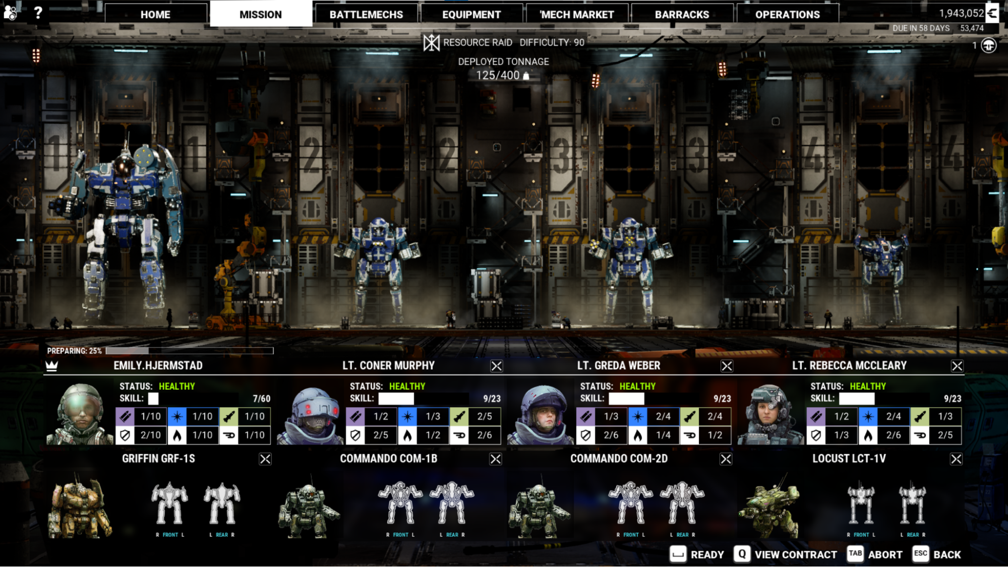
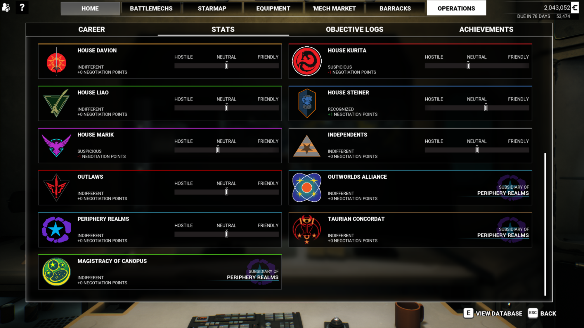
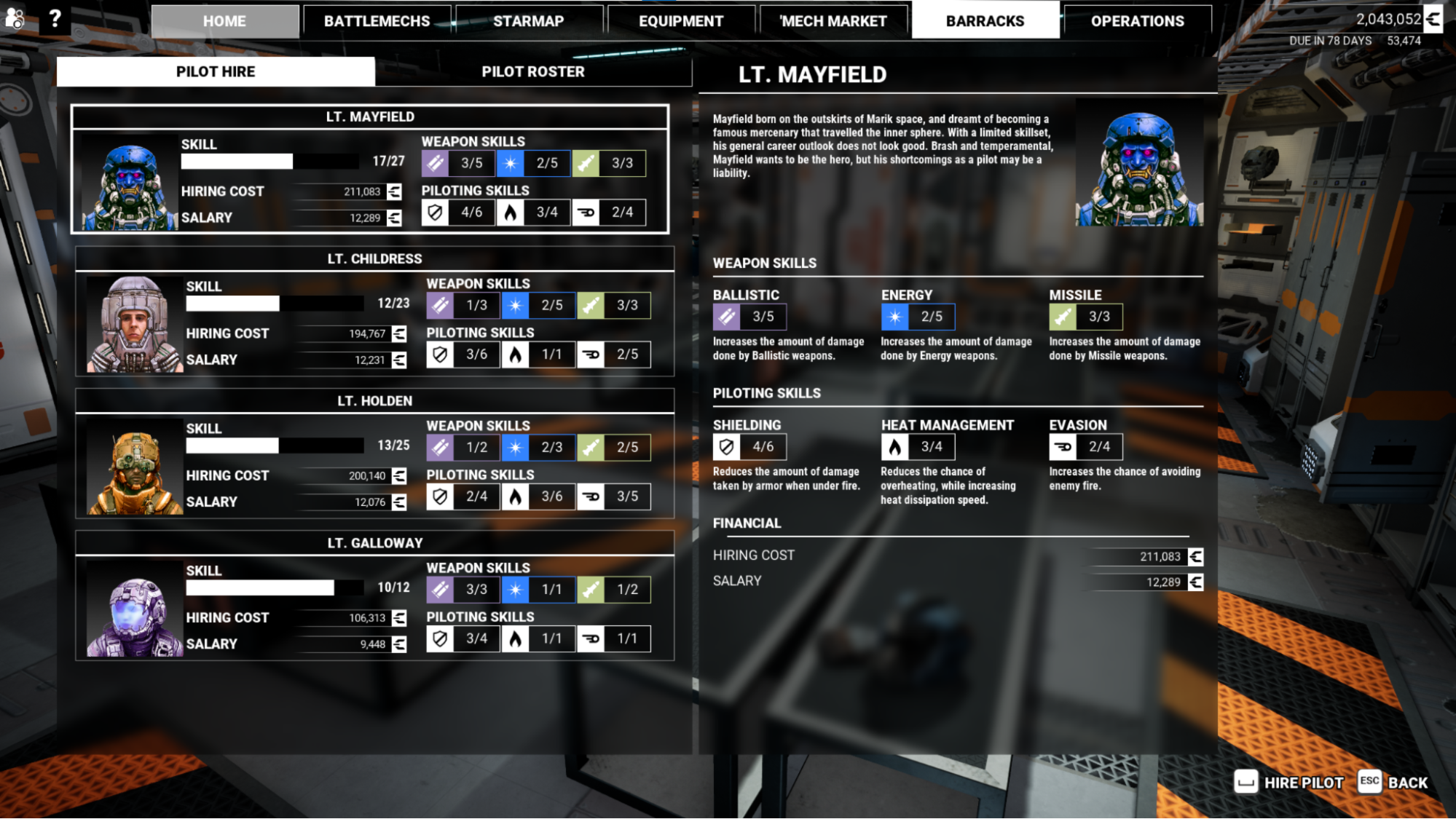
A large game where I was the primary source for UX on 60 gameplay screens. BattleTech is a franchise with deep roots, so it was a balance between tradition, franchise character and creating a functional UX across XBOX, Playstation and PC. In particular, this bridged many social menus and so required an adaptive interface.
Favorite Challenge Mech Equip Screen
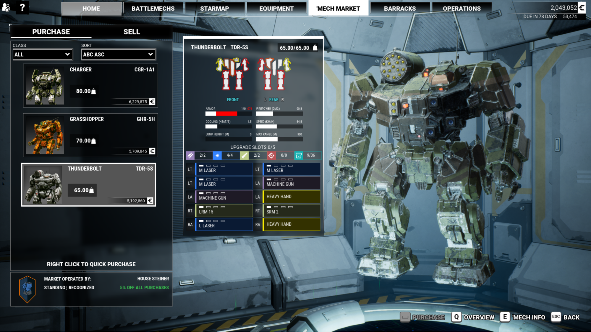
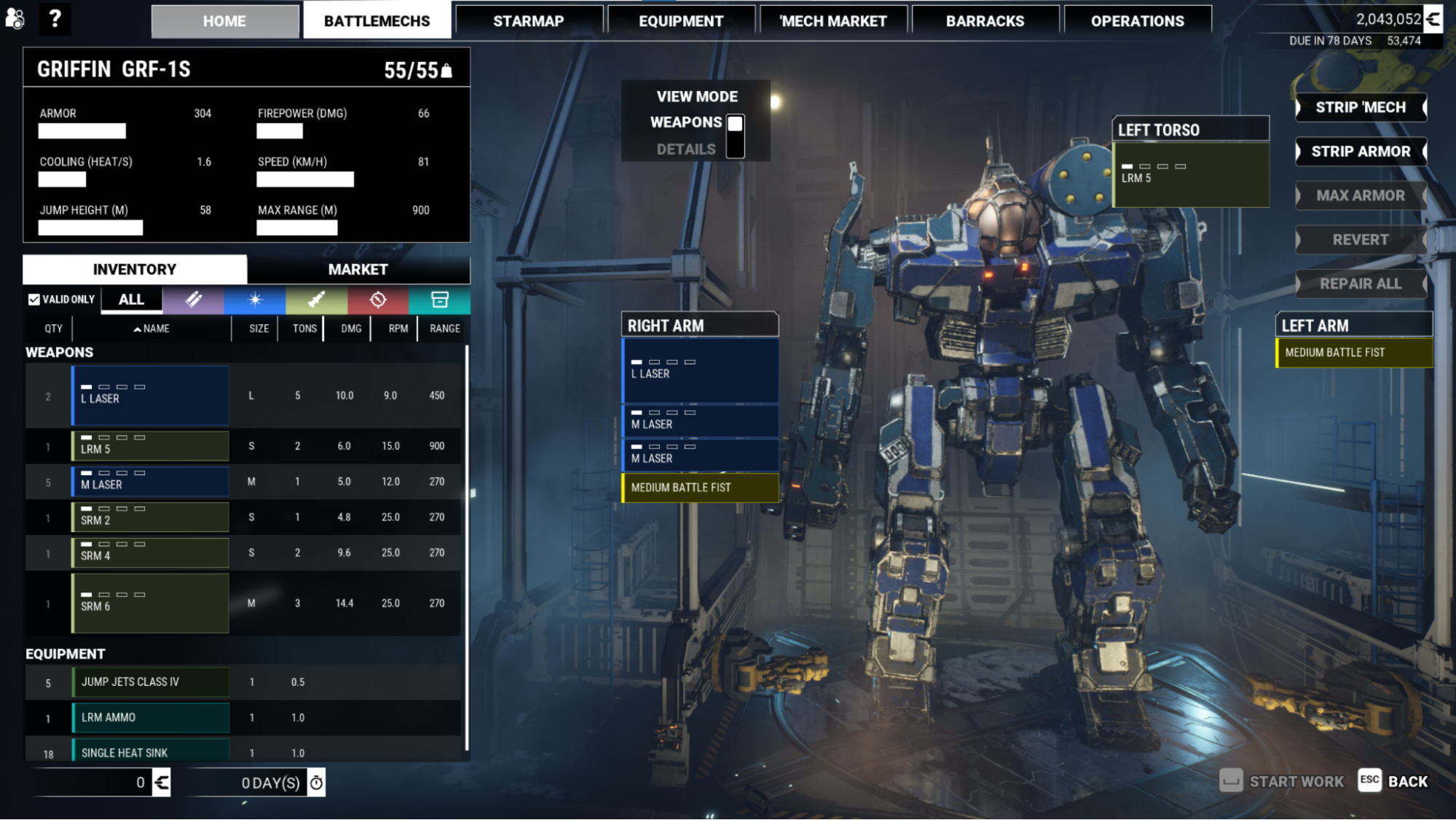
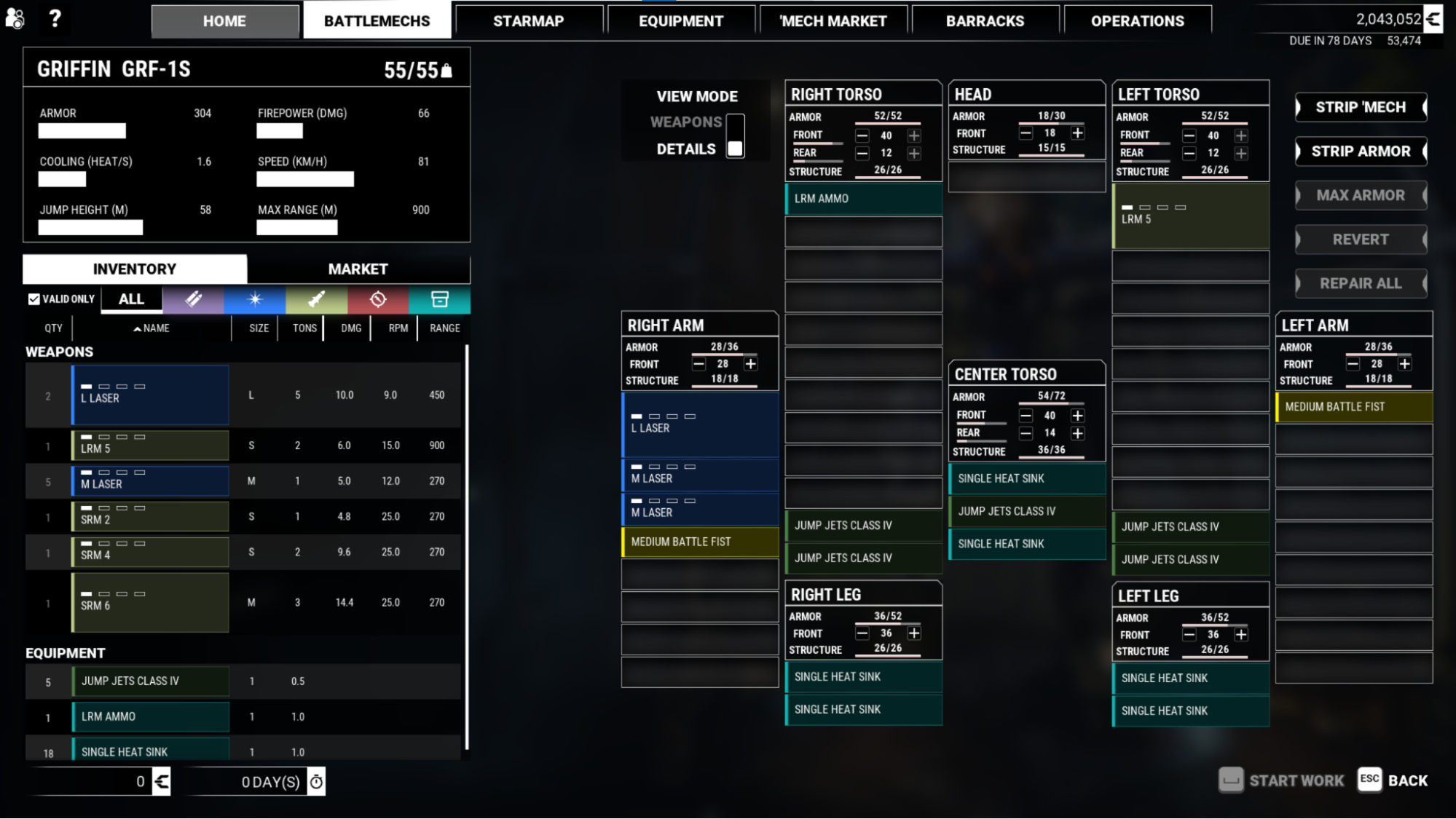
This screen is the crux of the MechWarrior experience. It had to be quintessentially BattleTech, while also being unique to MW5's mechanics.
Considerations
The screen and its nested complexities had to be compatible with both high end and casual players. It also needed to work on controller and feel easily navigable despite there being hundreds of selectable items on screen at once. The screen has a complex relationship to the ingame store as mech equipment has traits that needed to be easily identifiable across different UX scenarios.
Solution
When learning that the screen might benefit from multiple modes for basic players, I opted to make the full view togglable. This had a fantastic benefit of making the players Mech visible, and allowing our equipment screen to dominate the screenspace when selected. I created a system where mech equipment would be reliably displayed between store and loadout, with a quick view pip system for tier. Weapon types were also colourized with options for accessibility, and additional supportive icons per category so tabs could be used.
Other Favourite Homescreen with dynamic button stack
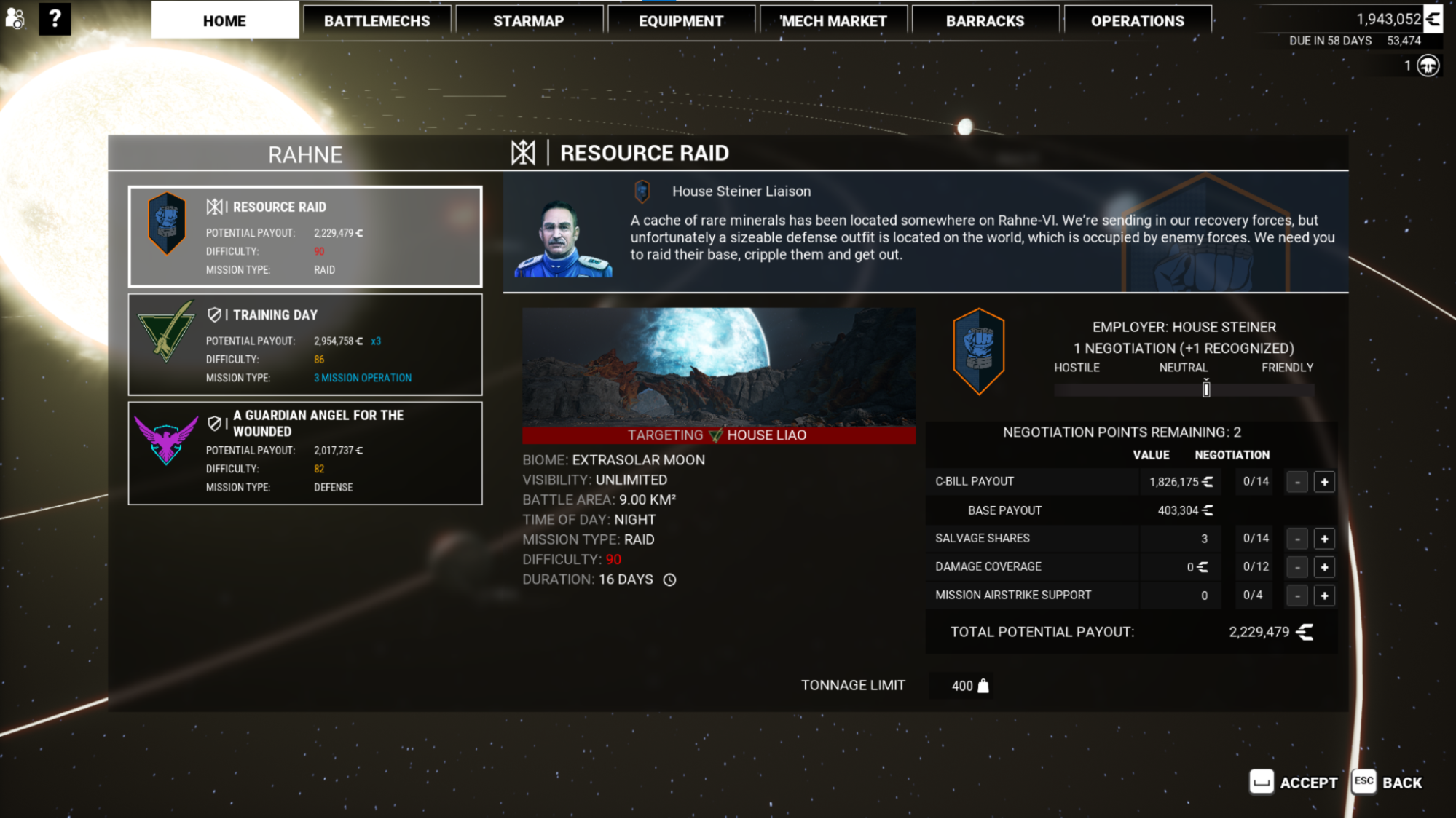
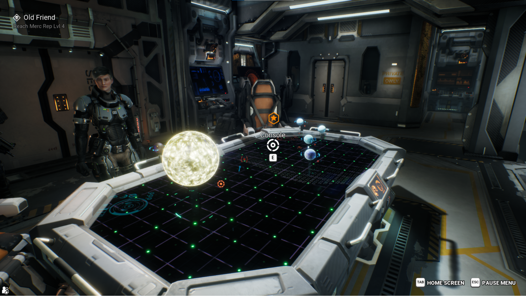
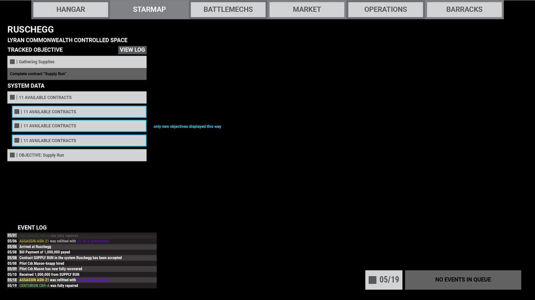
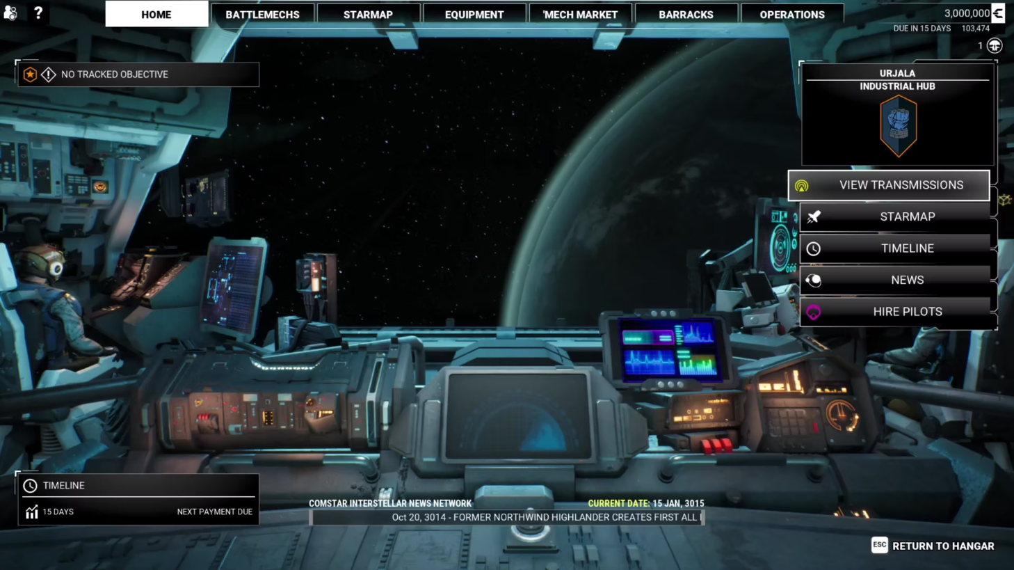
The main landing page when travelling to a new ingame star system had to address players' concerns for that region, and adaptively display what the player might like to interact with.
Considerations
The flow for each system could be quite dynamically complex, and both a high amount of activities and zero had to be accommodated. Making sure they stacked in an order that reflected players priorities was an additional UX challenge.
Solution
Showing the activities in an iconized stack gave players a familiar interaction location with a primary dynamic button for incentivizing Calls to Action. The main dynamic button had a carefully tuned flow for what we wanted to encourage behaviourally. Icons within the stack were reflected in both order and appearance to the star map, so it was easy for players to make decisions while maintaining a clean appearance. I also provided art direction for the homescreen reflecting the in universe ship bridge.
Other UI/UX Work for MechWarrior 5